Enabling Software Developers to Complete the Build-Measure-Learn Cycle

Let’s take a look at the classic Build-Measure-Learn cycle. How many people should be required in order to complete one iteration? Most successful developers I worked with were able to build a feature, collect telemetry data for it, analyze the data, tweak the feature accordingly and continue to the next iteration. People who can do this are unstoppable in building software that matters because they can iterate and learn very quickly.BuildMeasureLearn

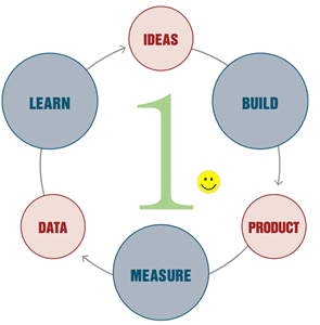
In many cases, completing the Build-Measure-Learn cycle requires just a small set of skills in addition to coding. These skills can be learned in a matter of weeks and at the job. They do not require deep statistical background. Of course, there will be cases when data does not make sense or when complex data modeling is required. That’s the time to engage with a data scientist if your team is lucky to have one.

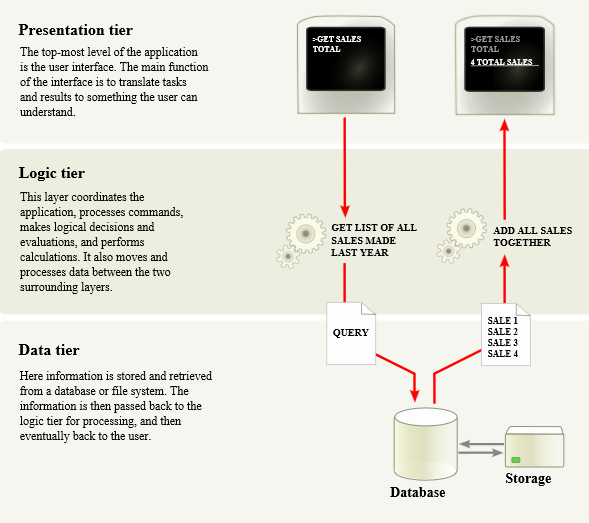
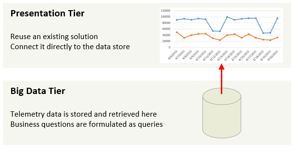
What does it take to enable every developer to complete the Build-Measure-Learn cycle? The “Build” part is given. Democratizing the “Measure” part requires a simple and robust data infrastructure. It should take one line of code to send an event when something interesting happened and one line of code to query the number of such events from a data store. If your team does not have a data infrastructure yet, it’s usually easier to leverage existing one instead of building your own. Shop around, there are a few good available. Some of them even hook into standard systems events like web requests so you do not need to write instrumentation code at all. And please do not build yet another dashboard just to show your telemetry data.

It’s traditional to think that the “Learn” part requires a trained data scientist or a market specialist. Sometimes this is true but in many cases it does not. Before starting on Bing performance I was a developer who spent most time writing code, debugging issues and analyzing error logs. In other words, dealing with one data point at a time. Back then I did not consider Excel or R as a part of my toolbox.

Developers are really good in dealing with one data point at a time. Here are specific things they can do to learn about their software from data. Spend a day or two to figure out how to connect Excel to telemetry data source and play with the data in a Pivot table. Start by plotting a daily trend of the number of users for your feature. Does it match expectations? Do weekends get higher or lower usage? Now take several weeks of data. Does the number of users trend up or down? If the overall usage is low, test all entry points for the feature and think how a list of entry points can be expanded.

Next, pick a metric that impacts user experience and you have direct control over. It may be a number of errors per user per day or 75th percentile of the application start time. Plot a daily trend. Does it match your expectations? Does it trend to the right direction? To improve the metric, think about a dimension that can impact the metric and “segment” by it. I wrote about funnels and segmentation in 3 Ingredients to Start Data-Driven Engineering Smooth and Easy. This will make the data actionable and allow you to change code and improve the metric.

Build-Measure-Learn cycle must be fast in order to stay competitive. I encourage software developers to complete it without external help as frequently as possible.

Revisiting Software Architecture Principles for Telemetry Data

Software engineering teams have been working with data for decades. It is data in apps and services they build. There is a well-known multitier architecture for data-driven applications.

Multitier

This is cool because it allows us to tune data schema for a specific domain, implement complex business logic and build slick user interface that will stand out among competition.

However the same approach applied to telemetry often leads to duplication and wasted effort. A shape of telemetry data does not change much from one app to another even across companies and industries. It aims to answer similar questions like how many times a feature is used, by how many users, how fast it is and if there are errors.

Borrowing and reusing is the key to build a robust telemetry system.  Please do not write code to create yet another dashboard that shows telemetry data only for your application. It’s usually cheaper and more flexible to connect an existing data visualization solution like Excel directly to the data source.

While application data captures the current state of the world, telemetry data stores rich history of user interactions and application behavior. Expect telemetry data to be orders of magnitude larger than application data. Apps with small usage may get away with a standalone database for telemetry. Ambitious teams who expect rapid growth should plan for a big data storage that supports MapReduce to process terabytes of data in minutes.

An architecture of a telemetry system can be greatly simplified. The only custom code that should be required are queries to formulate business questions.

TelemetryTiers

This approach can save weeks of engineering effort. Enjoy this time to make your app or service even better!

3 Ingredients to Start Data-Driven Engineering Smooth and Easy

Last time we discussed how data-driven engineering becomes a key skill for software developers. Here is an approach to data-driven engineering that does not require deep math skills.

Consider a hypothetical startup that just launched a web site that has a landing page, a sign up page and a welcome page after sign up.

Getting started web site example

This is a new product so growing the number of signed up users is the top priority. Unfortunately only few users has signed up so far. Can we do something better than just assuming that the startup idea is not appealing? Yes we can.

1. Instrument Page Views

The first step is to record an event when each page is displayed to a user. There are several commercial and open-source solutions available to instrument and store this data. Writing a row to a database from the page rendering code might be good enough to get started. The goal is to create a table that has a page name, a timestamp and a user ID. There are many clever ways to uniquely identify users. Storing a GUID as a cookie works in most cases.

Getting started raw data

2. Prioritize with Funnels

Marketing funnel is a well-known technique to drive users from prospects to clients. The idea is to identify an entry stage, a desired stage and stages between them. The number of users dropping at each stage can be measured to focus marketing resources on a problematic stage. The same technique can be applied to users navigating web pages.

Getting started funnel

This can be done by filtering the timestamp to the time period of interest, grouping by the page name and finding a distinct count of users.
Getting started funnel query

The result shows the number of unique users per page. The lowest percent of users going to the next page indicates the focus area.

Getting started funnel table

It appears that 90% of users who saw the landing page clicked the sign up button. Not bad for a startup. This hints that customers are interested in the product. However only 10% of users who got to the sign up page were able to sign up successfully.

3. Debug with Segments

Something must be wrong with the sign up page but this high level picture is not actionable. Analyzing data user by user is too expensive and not necessarily actionable as well. We need to find something between these two extremes. The goal is to narrow a problem by finding a subset of users (aka segment) who have challenges signing up. Let’s apply creativity and domain knowledge to brainstorm segments that can impact ability to sign up. Here are some examples: a user age, a country, a day of the week and a browser type. The segments should be prioritized by their potential impact and ability to get data for them. For example, people tend not to share age online so the age segment goes to the bottom of the list.

A browser type can be retrieved from a user agent string. This is easy enough to get started. So far the telemetry table has a page name, a timestamp and a user ID. Let’s add the browser column for each page view, filter by users who got to the sign up page or the welcome page and group by the browser type and the page name.

Getting started raw data with browser

Are there browsers with low sign up rates? Indeed it looks like the sign up page has a problem in Firefox:

Getting started segment by browser

This aha moment is called an insight. It’s now possible to debug the sign up page in Firefox to pinpoint and fix a browser-specific issue.

Caution: real life examples will not be so black and white. Difference in values for a segment can be caused by noise in data. For example we may have only one Firefox user who decided not to sign up. Math has been developed to calculate so called statistical significance to measure a chance of the delta for a segment be a result of noise. Learn and use this math or just investigate largest segments that are most different from other segments.

Empty Theory

There must be another issue in this example because percentage of users who were able to sign up even for IE and Chrome is still quite low. Let’s use the same technique to segment telemetry data by a day of the week.

Getting started segment by day of the week

And this data shows us (drum-roll…) nothing. The ability to sign up does not depend on the day of the week. It’s OK. It’s common to try several empty theories before finding an insight. Do not give up when this happens. Continue brainstorming segments and involve new people with domain knowledge when running out of ideas.

Another Insight

Next let’s segment telemetry data by country. It will be a bit more work because it requires to reverse geocode a client IP address.

Getting started segment by country1

This segment brings an interesting insight. Users outside of USA have very low sign up rates. It is not a language issue because Great Britain also speaks English. Looking at this data side-by-side with the sign up page hints that the required State field allows to only pick from 50 USA states. Additional check on users who did sign up from Great Britain and China show that most of them have picked the Alabama state that is the first one in the list. The sign up page should be redesigned to support customers from all countries.

Takeaway

  1. Instrument page views
  2. Prioritize with funnels
  3. Debug with segments

Instrumentation and funnels are straightforward software development work. Segmentation is an art. It requires domain knowledge and creativity to come up with a prioritized list of segments and then code knowledge to debug interesting segments.

This technique can be applied to any web site or an application that has a flow of user actions. It is a good way to start on data-driven engineering without spending a lot of time learning math upfront.

Data Driven Engineering: Why Should I Care?

Remember these old days when software engineering teams used to tune software until it passes quality gates, give golden bits to marketing and throw a big release party? The world was nice and simple and writing code that works according to a specification was enough to be a star developer.

Things have changed now. A lot of code has moved to services that are always connected. Even apps usually dial back home to record telemetry about their usage and health. This data flows back to engineering teams who became accountable for making sense out of this data. Engineering teams now share responsibility for driving business metrics such as revenue and engagement. Some people call it data-driven engineering. I think about it as a fundamental shift in a role of software engineer. Teams who can leverage data-driven engineering will delight customers by learning about them more than customers know about themselves. Teams who ignore data-driven engineering will continue based on assumptions and will eventually lose competitive nerve.

Telemetry data is not a bug report with a local repro or a trace. It will take forever to analyze it user by user to find patterns in any sizable application. Software engineers need new skills to analyze telemetry data at scale and make changes in code that will drive desired changes in user behavior and software health.

Wow, it looks like a different job now. Most of us learned basics of math at school. Some of us may have taken a statistics class in college. However, until recently, a data analyst and a software engineer were two distinct professions. Many of us did not have a chance to practice math and stats while writing code and going to ship parties. Well maybe it’s time to blow dust off that old math book.

Unfortunately the entry barrier is quite high. The same way we are comfortable with design patterns, popular libraries and profilers, data analysts are fluent with things like population, types of sampling, p-values, decision trees and so on. It may take months to learn it deep enough to apply for your projects. I was lucky to study applied math and computer science in college, forget math during the first 8 years of my career and then relearn it to be a part of data-driven engineering in Bing and Visual Studio.

This blog will make it easier for software developers to join the world of data-driven engineering. It is not about pure data science as this topic is covered well elsewhere. Instead I will focus on a practical approach that sometimes deviates from classical data science but is easy to learn and apply.